For years I succumbed to the trap of believing that a black, white and tan wardrobe was the secret to looking luxe. And hey, it probably is. It’s certainly the trick to how some of my friends look a million bucks in an outfit they spent just under $100 on.
As perennially in style as it may be, a black, white and tan look on repeat can also get predictable and boring.
These days I’m turning my attention toward trend-setters who manage to cleverly incorporate colour into their style. I’ve lost hours studying how Sofia Richie manages to make neon lime and candy pink look expensive.
But where to start when choosing which colours to uplift one’s own wardrobe with?
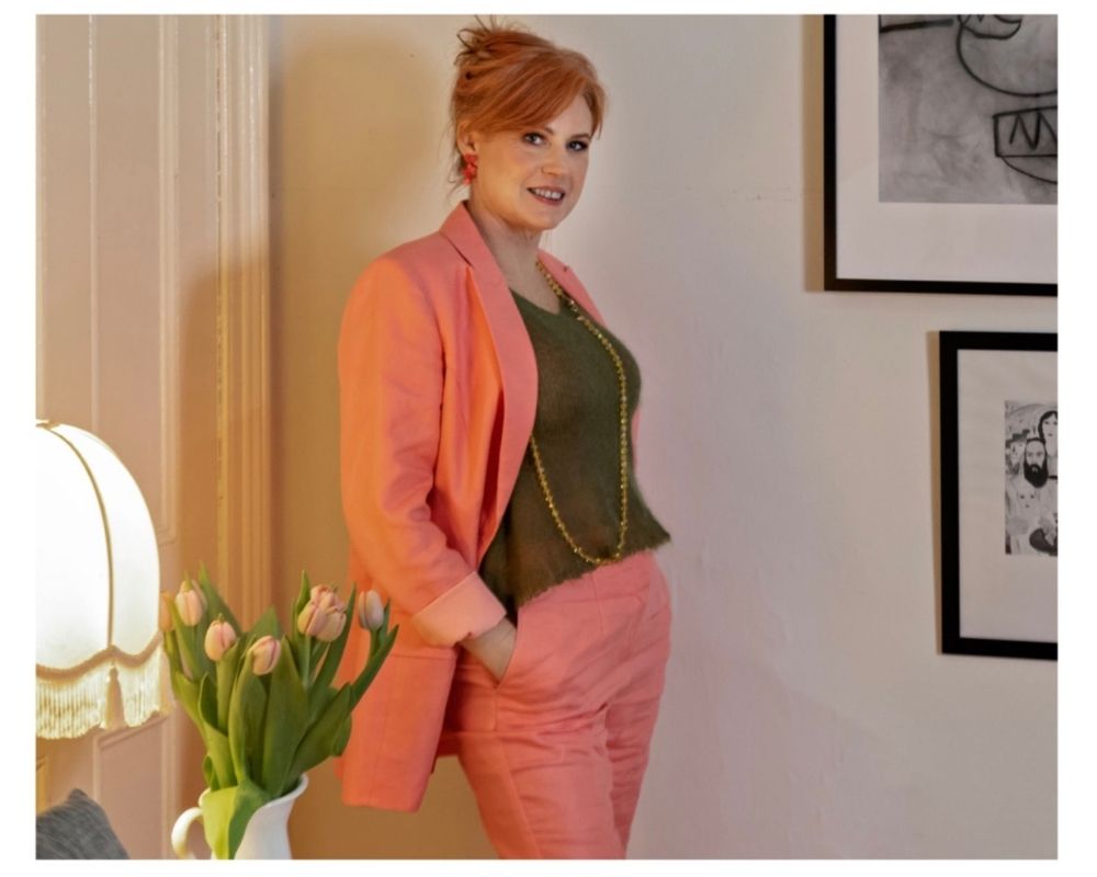
Donna Cameron is a colour and style specialist based in Melbourne, Australia. She’s also an authority on ethical fashion issues; Donna co-produced a documentary about a proposal to flood Aboriginal land with unsustainable cotton crops that won a United Nations World Environment Day Award in 2000. Donna says colour is the secret to creating a sustainable wardrobe – and she’s so passionate about the topic that she wrote a book titled just that (Colour: The Secret to Creating A Sustainable Wardrobe). Here Donna explains how selecting the right colours will improve your appearance and also help you curb any unsustainable shopping habits, such as repeat buying or wearing something only once before discarding (or worse – not wearing it at all).
What is the role of colour in creating a sustainable wardrobe?
Your use of colour is just one way to bring a more coherent and strategic approach to your wardrobe. Once you get the hang of it, it’s inexpensive and easy to implement whoever and wherever you are.
Start with working out what colours are best for you; This is the difference between looking radiant, or tired, blotchy and ghostly. Your colour palette doesn’t need to be restrictive; there are millions of colours!
Then as you add to your wardrobe using the colours that work for you, your acquisitions will become mindful and strategic, and your wardrobe more sustainable because you get full value from your clothes (and receive plenty of compliments along the way).
In a nutshell, if you can get your use of colour right:
- It’ll make identifying potential new purchases a breeze
- You’ll no longer buy things just because they’re cheap, that you don’t end up wearing
- You’ll be able to colour co-ordinate like a pro
- Your clothes will work together perfectly so nothing sits in your wardrobe unworn.
How can someone work out the best colours for them?
The key is to select colours that are as light and bright as possible without overpowering you. Most of us want to direct attention upwards to our face rather than elsewhere and you can do this by choosing colours that don’t steal the show.
The blink test can be helpful in determining if a colour is too vivid for you. If you stand in front of a mirror and close your eyes for a few seconds and then re-open them, observe what you see; is it you or is it the colour? If it’s the colour, it’s overpowering you.
However, nor do you want colours that look drab and dreary as they will have two negative impacts: They’ll appear visually heavy and potentially give the impression that you are too, and they’ll cast dark shadows onto your face, making you look more tired and less vital than you really are.
Without having a professional colour analysis, there are two surefire colours you can wear beautifully (and this will work for everyone). You will look fabulous if you wear colours that match
- Your eye colour
- Your hair colour
For example, if your hair is silver grey, you’ll look amazing in a silver grey top or dress. If your eyes are blue, they will really pop if you wear blue. This is because harmonising with your natural colouring always looks right.
If you know anything about art, you’ve probably met the colour wheel and know that there are warm colours and cool colours.
As a general rule, redheads and golden blondes (assuming the hair colour is natural or works with the complexion) will be warm. Black, white, platinum blonde or grey hair are all cool. There are numerous shades of brown so brunettes can be either warm or cool.
Warm colours are easier to identify; they are the colours of fire, so red, yellow and orange but not a cool raspberry red. That is not a fire colour. A warm colour has an undertone of red, orange or earthy brown.

Cool tones are on the other side of the colour wheel and have a blue base. These are the more shadowy tones. Any colour that has a blue, grey or black undertone is said to be cool. But note that there are also warm versions of blues; aqua, turquoise and teal are all warm blues.
Violets and greens can be either warm or cool. You will find a version of both of these that will work for you. Guaranteed!

You can determine whether you have predominantly warm or cool colouring by looking at your skin, hair and eye colour to see if they correlate with colours on the warm or the cool side of the wheel.
Skin colour can be more difficult for the average person to analyse. Despite what you may have heard, there are no rules for ethnicities; Asian, African, Latino or Caucasian people can all be either warm or cool.
Do you believe you can have too many colours in your wardrobe? What is the ideal number?
The simple answer is no! Not if you understand the elements of colour and choose accordingly. My wardrobe is like a rainbow but everything has a toasty warm undertone so they work together.
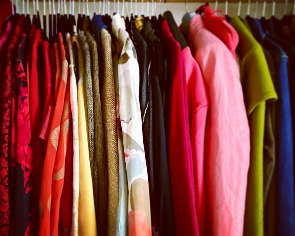
However if you’re just learning about colour it might be easier to start off with fewer colours and build from there. You can train your eye to see colour and to identify the common elements so you can increase your range over time.
Do you have any specific rules for choosing neutrals vs accents?
This is NOT a rule, but if you’re transitioning to a colour-coded wardrobe where everything co-ordinates together well, I recommend choosing a few neutrals and colours to begin with.
If your colouring is cool, you might choose black, white and navy as your neutrals. If you’re warm you could choose ivory, olive and burgundy as neutrals. Neutrals often form the foundation of our wardrobe and can be mixed and matched easily with other colours.
In my opinion it is important to incorporate colours alongside your neutrals to keep things interesting (and to avoid being mistaken for waitstaff in restaurants if your neutrals are black and white!). So choose around 3-5 colours as well (as in, not neutrals).
The most important thing is to choose your neutrals that have the same temperature as your colours; warm with warm or cool with cool.
Do you have any other specific rules you follow when working with colour?
I always prefer guidelines over rules, but one thing I stick to closely is not combining colours of different temperatures together. An understanding of colour theory is needed to implement this effectively but put simply, warmer colours tend to clash with cooler colours, so choose to go either all warm or all cool.
I’m a big believer in choosing colours that will be your support act. You should be the star of the show so the colours you wear should enhance, not overwhelm you.
I don’t mean we should all avoid bright colours and go all ‘coastal grandmother’ by dressing in beige! For some of us, beige is the last thing we need. It can make us look ashy and unwell. If you understand which colours add a natural radiance to you, then you can’t go wrong!
Can we see an example of colour working really well, and an example not so much?
Take a look at this image comprised of three examples of me.

In two of the examples, I am wearing warm colours that harmonise well with my auburn hair and softly warm skin. Where I am wearing black and grey, you can see it makes me look ashy and tired.
Here’s another image comprised of two photos that illustrate the concept of using colour as a focal point.
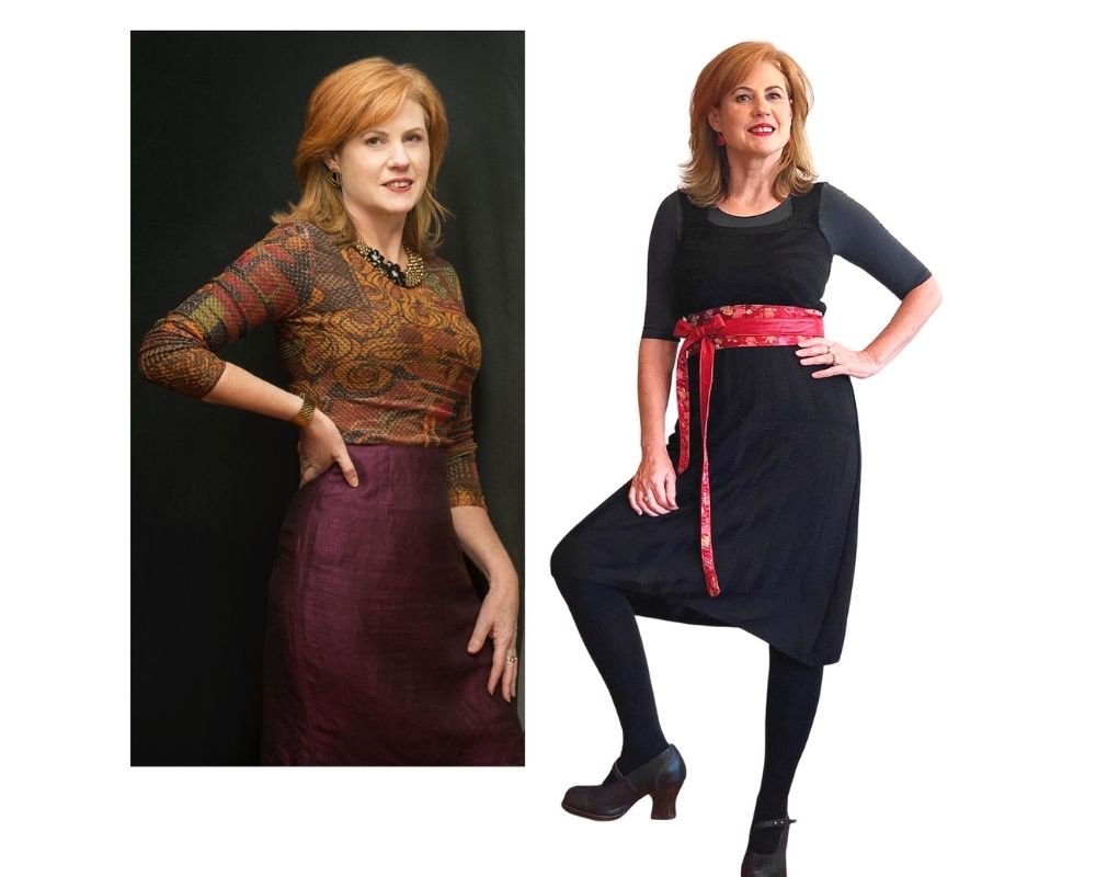
With the black dress I have tied a red belt around the middle. The red belt is stealing the show, making me look wider than I need to, and you forget to look at my face. Also, the black dress throws shadows onto my neck which is doing me no favours.
In the photo on the left I am wearing a top with colours in it that harmonise perfectly with my own natural colouring. You see my face because the colours are leading your gaze upwards.
How can we make the most out of accessories when considering colour?
Accessories can add value in a few ways. As you’re transitioning to a wardrobe of colours that will look AMAZING on you, you won’t be discarding everything you have (that would hardly be sustainable!). So you need to find a way to work with what you have. Accessories can help you to bridge the colour gap as you gradually acquire more pieces in your chosen palette.
For example, if you have a black dress and you realise it’s not doing you any favours (heaven forbid!) you can choose to wear a scarf in colours that light up your face along with your black dress.
Colour can be used to direct attention to where you want it and to shift it away from where you don’t. Accessories in cleverly chosen colours can create focal points in your outfits where you want them. This works because whenever you introduce an accent colour that contrasts with or stands out from a main colour, it will attract attention.
For example, imagine wearing a monochromatic black or grey outfit (top, jacket, jeans and boots) and you add a wide red belt OR red earrings OR red boots. It is the red accessory that will attract the attention.
So you get to decide; do you prefer attention up at your face, at your waist or down at your feet?


