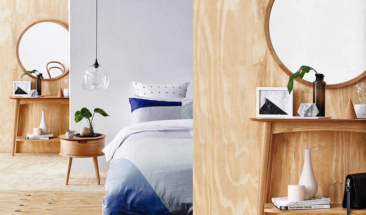
Stylist Sarah Cousens shares her simple tips for creating the Nordic look in your bedroom.
The bedside breakdown
Beneficial to all number of decor schemes and spaces, the “accidental” (yet totally intentional) vignette can be complex to master. Sarah opted for a sleek hexagonal tray on the side table. It acts as an anchor for the decorative items placed on top and forces you to cluster your objects. The result is that you create a tidy styling moment rather than a hot mess. Plus, if your items are on a tray they’re a lot easier to move around when you find yourself in need of extra space. Win/ win.

When more is more
Let’s talk about the bed. Sarah’s advice is to “layer minimalist patterns with neutrals to create a clean yet cozy look”. Here, she’s used upwards of 3 patterns, as well as a palette of white, grey, mint and bold blue. Why isn’t it over the top? Commonalities like consistent straight lines or a family of cool colours marry the different elements. Also a number of the patterns work more like subtle textures. Plump up those pillows and you’re good to go.
Style with shapes
“Geometric shapes give the space a clean feel,” Sarah says. Note the cork cone, marble effect prism, and of course, that generous round mirror. Gorgeous as they are, alone they can be too harsh. “Pair them with organic lines to soften the look and create a more bedroom-friendly feel,” Sarah adds. And right she is. The grain on the timber feature wall is the hero here, but the touch of greenery and the fluidity of the ceramic vessel have the same end game.

The Carousel thanks Temple & Webster stylist Sarah Cousens for this article. Shop the Nordic look here


