
While the contestants on The Block jostle for supremacy on the new hit Nine series, judge Shaynna Blaze has a DIY tip guaranteed to put the winning polish on your own home.
We caught up with the popular interior designer and co-host of Selling Houses Australia to find out how rooms can be transformed by Violet Verbena.
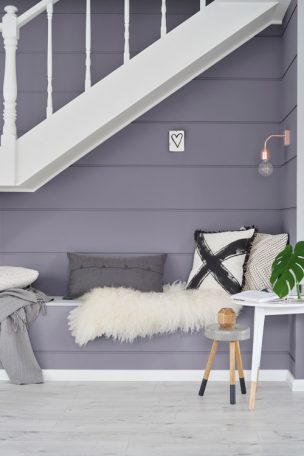
Violet Verbena is a bit of a Colour Chameleon isn’t it? It can read more blue-purple in some contexts and feels more dove-to-dark grey in other situations.
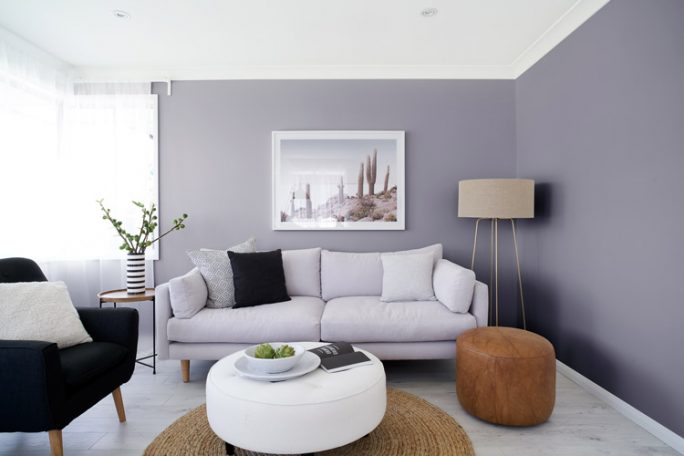
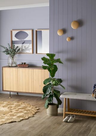
Violet Verbena is a warm grey tone that plays in its environment. It is a chameleon that takes on strength when paired with steel greys, black and light timbers and softens when aligned with white, purple and walnut-based wood. Violet Verbena will be warm in a north- and west-facing natural light and incandescent light globes but takes on the cool light refractions when used in cool light and in rooms with south-facing windows. Violet Verbena is a new player in the neutral palette at quarter and half strength but can become a feature colour at full or double strength. Violet Verbena can add strength to a modern, minimalist interior while also being the feminine touch in a period interior, hence its chameleon qualities.
Are there specific rooms which you think would be better suited to a Violet Verbena treatment?
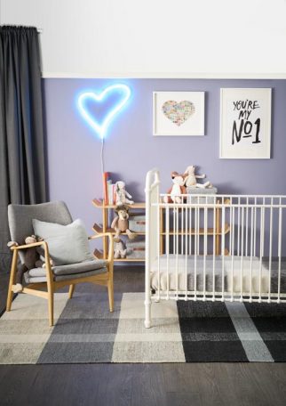
Due to the warmth of the colour I see this colour working seamlessly with exteriors, living areas and bedrooms. Warm-based colours have a calming quality. It will all come down to what Violet Verbena is teamed with in an interior scheme that will determine whether it is the main player or the supporting role in a scheme.
Seeing as Violet Verbena could be a New Neutral, how would you use this colour in connecting rooms?
Many modern homes work with an open-plan layout but it can be a struggle to define the areas. Working with quarter-, half- and full-strength measures of Violet Verbena will not only help define spaces but add tones and textures to any interior. For connecting areas such as hallways it is a good rule of thumb to keep this as the lightest area and add depth of colour to what I call the ‘hidden’ rooms such as bedrooms and studies to add extra impact.

Despite the colour’s complexity and mutability, if you mention the ‘purple’ word it can put people off. Why are some people afraid of the polarising ‘P’-word?
Let’s be honest, purple can be associated with a dated or ‘nanna’ interior and the association with this has a negative reaction to purple. But due to the surge of interest in navy and indigo in the past couple of years, moving to purple- based colours is a natural progression. Purple sitting alongside indigo and the mixed metal tones such as brass, copper and rose gold has now taken on an elegant foray to Violet Verbena in a contemporary interior scheme.
What other colours would play nicely with Violet Verbena?
Having Violet Verbena as a neutral in quarter-strength lends it to a strong palette with contrast tones in greys like Taubmans Endure Ship Shape & Black Flame. This works well with oak timber contrasts and Crisp White trims. Taking the lead from nature and contrasting it with green tones creates a relaxing and soothing look. Colours like Taubmans Endure Summer Storm and Mohawk Blue add a romantic look without being whimsical. Adding a soft white like Taubmans Windswept Beach completes the tonal colour palette.
On the flipside, what neutrals would bring out the colourful best in Violet Verbena?
White-based neutrals such as Taubmans Endure Winter Morn, Snow Ballet and Powder Fresh create a fresh spring look that feels like the first real sunshine when spring hits. Where grey neutrals like Mink Scorpio Half, Salinger Quarter and Mountaintop is like a soft breeze.
For some people, paint on a wall remains just that. But how do you approach and ‘feel’ colour?
Colour is so intertwined with psychology and personal experiences, for some people the thought of introducing certain colours that relate to a bad experience, almost numb them with fear. Colour almost always evokes a mood that is either intentional (e.g.: green for calming, blue for cooling a space down) or it is a colour you feel you have a “connection to” as it draws you in aesthetically or emotionally. No matter how you approach it, colour will always play out visually in a room but is physically reactive to how you feel, or will feel.


