
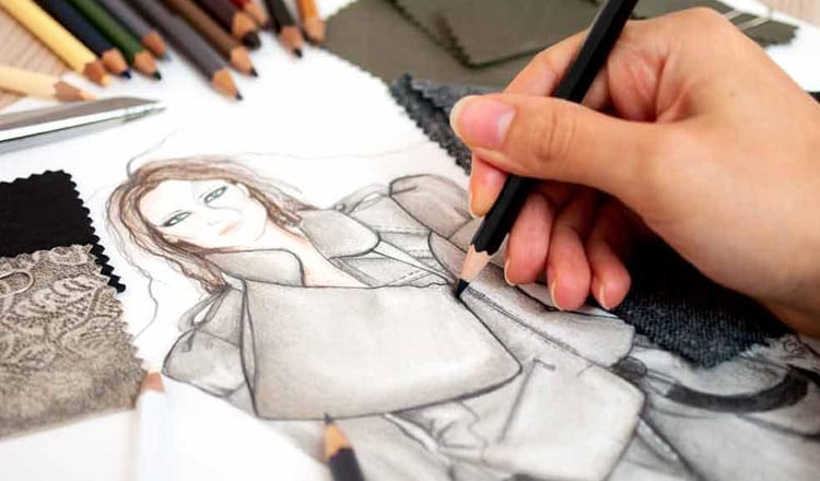
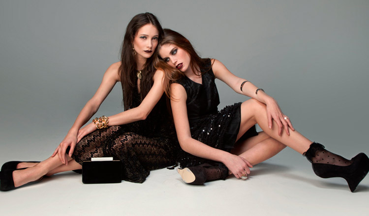
When it comes to creating fresh fashion trends, everything counts: cuts, materials, textures, shapes and colours. Especially colours.
However, the designers aren’t the only who have their say in choosing on trend colours; people from the colour expert company Pantone have a big role, too.
Thanks to its remarkable, and pretty accurate “predictions”, we can assume what shades will be most popular for two years in advance.
Magical shades of Pantone
Pantone Inc. started as a printing company and during the time developed the unique Pantone Colour Matching System – a standardised colour reproduction system presented through cardboard sheets, which is supposed to help companies combine shades without making a mistake.
The idea is quite simple: each shade is marked not only by its name, but also with the specific code, that is the same all around the world; for example: Aurora Red (18-1550), Dusty Cedar (18-1630), Riverside (17-4028), etc.
Pantone set up standards and their influence has grown through time so much that they even got to choose the “Colour of the Year”, thus influencing graphic designers, interior designers and also fashion designers. Their predictions are more anticipations than divination, based on extensive cultural and psychological studies.
The colours of the year
When the Rose Quartz trend exploded on Pinterest, it went beyond runways of the biggest designers, like Louis Vuitton, Oscar de la Renta, Dior, etc.; it was also used as inspiration for the Transgender pride flag.
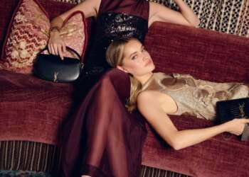
Vivid shades of New York Fashion Week also re-affirm the impact of Pantone predictions. Many different designers, from the budding Olivia Palermo to Valentino, Prada and Gucci, used this palette in their designs. Chloé, for example, also followed this trend by using its natural shades for to create a collection that represents a mix of femininity and a boyish attitude, inspired by the free spirit of Anne-France Dautheville, the French journalist and writer from ‘70s.
What to expect?
Pantone’s palette of top 10 colours continue the trend of natural shades, already inspiring fashion designers to make playful combinations.
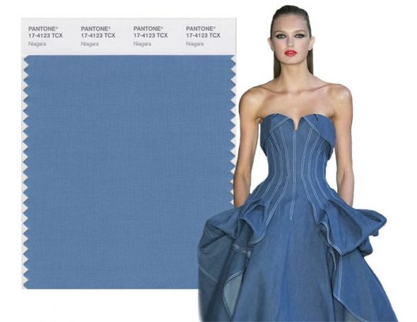
- Niagara (17-4123), which is like a classic denim blue colour, evoking relaxed and comfortable feelings, made its way to haute couture gowns, carefully crafted by Carolina Herrera.
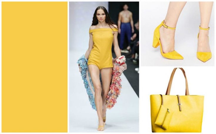
- Primrose Yellow (13-0755), even if it’s a joyful and warm shade, it can be worn in colder days, like fashion blogger Rosyl Mejia showed us.
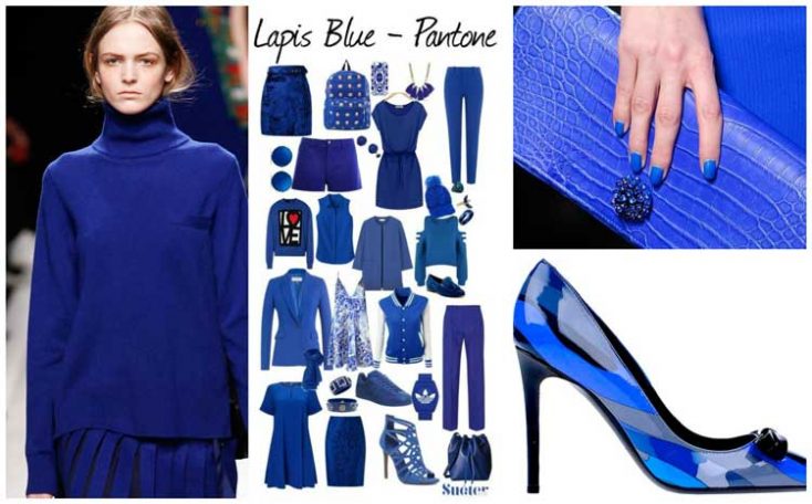
- Lapis Blue (19-4045) with its boosting energy effect is a good choice for accessories, like a bag or a statement necklace.
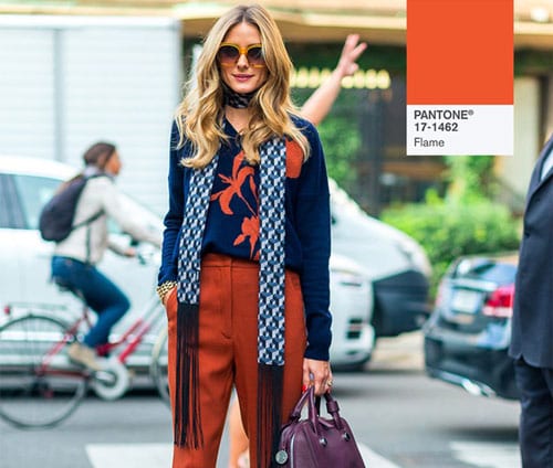
- Flame (17-1462), fun and theatrical shade, can be easily combined with many others, like Gabriela Hearst and Lela Rose did.
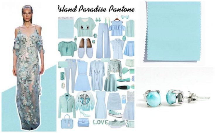
- Island Paradise (14-4620), a shade which evokes a tropical setting in our minds just with its name, inspired Victoria Beckham and Lela Rose to creating luxurious panne and lace dresses.
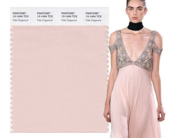
- Pale Dogwood (13-1404), peaceful and innocent shade continues the trend of one of the “Colours of the Year 2016” – Rose quartz, which was already recognised by designers of Banana Republic, Ryan Roche, Lacoste, etc.
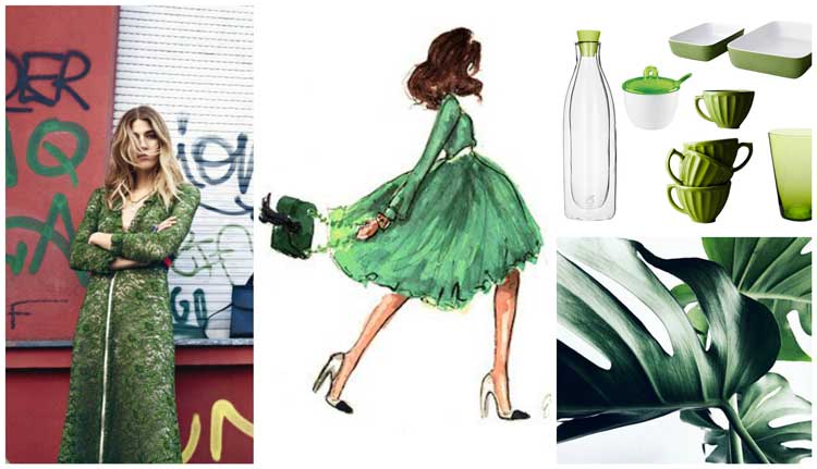
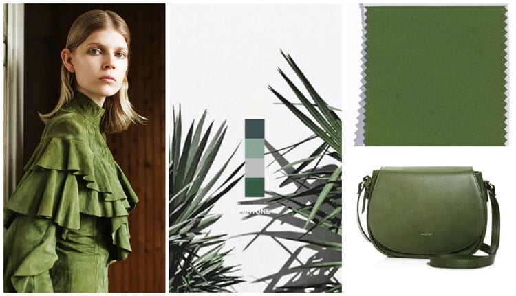
- Greenery (15-0343) should bring more nature and oxygen into the fashion, as seen on Zac Posen, Trina Turk and Cynthia Rowley’s collections.
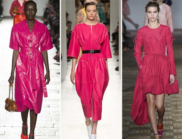
- Pink Yarrow (17-2034) is festive, bold and vibrant colour, that was already on show as part of Cavalli’s collection.
- Kale (18-0107) resembles the military shade of green, so it’s no wonder it inspired DKNY designers to create shorts, bracelets and jackets in this colour.
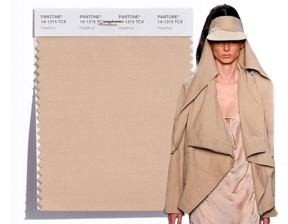
- Hazelnut (14-1315) is a natural and unpretentious colour that can be used as a transition shade when creating combinations not only in this season, but during the whole year. Kanye West and Dennis Basso recognized this potential by introducing Hazelnut into their collections.
If you want even more options, try out Pantone’s app, Studio – it offers the possibility to test and explore numerous shades and it will keep you updated on the latest colour trends in fashion.


